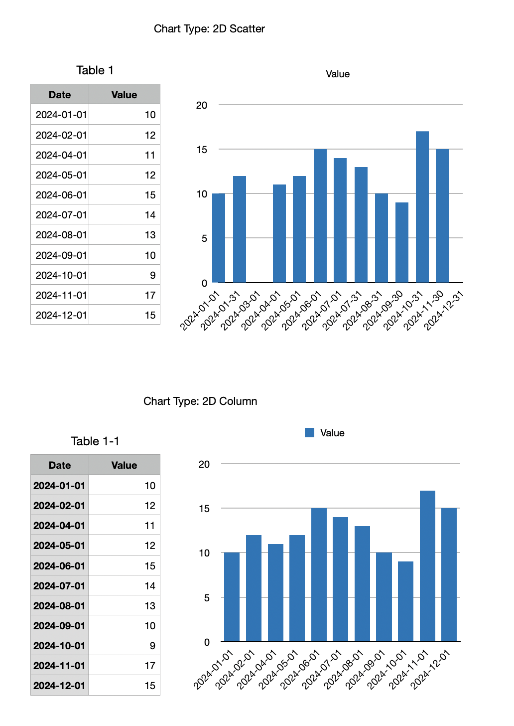
Yes, you can do the same in Numbers. You need to use the 2D Scatter chart type instead of 2D Column.

Things to know about 2D Scatter Chart.
Unlike with a 2D Line Chart, with requires a Header Column, the left column in the data table for a 2D Scatter Chart must NOT be defined as a Header Column (shaded by default).
To get a 2D Scatter Chart to look just like a 2D Column Chart you need to apply a few tricks.
Click the series in the chart and in the Series tab in the right panel add Y Axis Error Bars > Negative Only > Use Percentage > Range: 100.
Click on of the error bars that now appear in the chart and adjust the Bar Style, thickness, and color in the Error Bar panel at the right.
Click the series in the chart (at the top of an error bar; it can be a little tricky to click in just the right spot to select the series) and in the Style panel at the right choose None for Data Symbol.
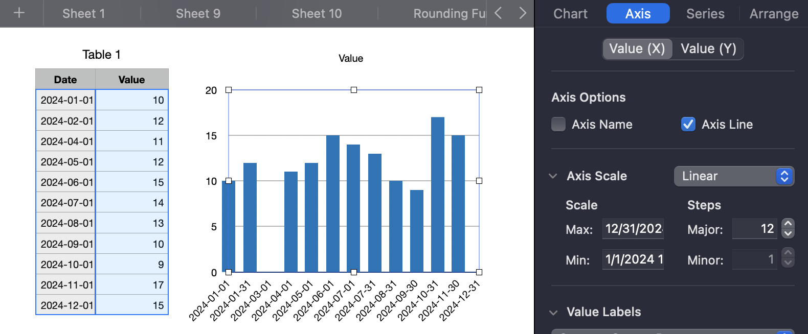
Then click the chart (not one of the elements within it) and go to the Axis tab at the right and choose the Value (X) tab. There you will need to vary the Min: Max: (enter dates for each) and the number of Steps. What worked for me (you would use 31/12/2024 instead for Max) for this example was this:

It's a little fiddly, but of course charts in Excel can be fiddly too, just fiddly in different ways.
With a little experimentation you should quickly get the hang of it. But if you get stuck, post again.
SG