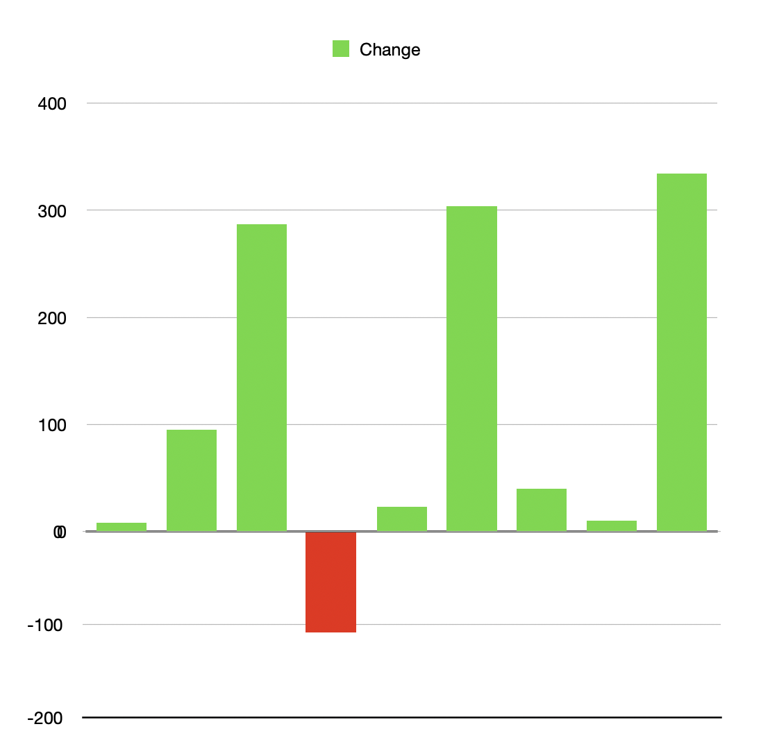
Separating the data is certainly the easy option here.
You don't necessarily need to change the source data, though. If your data is in Column B, then you could add (a hidden?) column C for positive values and column D for negative values (using simple IF() statements against column B).
In this way you continue to have a single column for all your ±values and Numbers automatically filters this into positive and negative value columns, which you can add to the chart.
The only other ideas I had was a 2-axis chart with min=0 on one side, and max=0 on the other, then add the series twice, but that doesn't work since it still shows values above/below the line.
That led to the last option I had, which is two separate charts.
One chart has a Min on the Y axis set to 0, so it surpasses negative values
The other chart has a Max on the Y axis set to 0, so it surpasses positive values.
Now you have two charts referencing the same column of data (so you avoid having to split the data), and creative positioning of the charts on screen should give you what you want:

(this is two separate charts with different Min and Max values for the Y axis)